

Cafe Siete - Logo Design
Cafe Siete is a neighborhood café located in Jamaica Plain, a neighborhood outside the bustling downtown area of Boston, MA. The company was founded by Jeb Taylor, a local business owner, who wanted to revitalize the empty storefront and bring reliable service, good coffee, and community atmosphere to his neighborhood. He contracted my services to design a logo that communicated his brand and vision for Cafe Siete.
My roleGraphic Designer (freelance)
DateMarch - May 2024
Step 1: Project Assessment
My first step was to talk with the client about his vision of the Cafe Siete logo and the brand as a whole
Logo requirements
The logo must:
Communicate Cafe Siete’s modern & clean atmosphere.
Instill a feeling of reliability & professionalism.
Retain a sense of approachability & neighborhood friendliness.
The logo should feature:
An icon, as well as a wordmark featuring the business’s name.
A representation of the number 7 (in Spanish, “siete” means “seven”).
A black-and-white silhouette design that can be branded with color at a later stage.
Step 2: Ideation
After understanding Jeb’s vision for the logo, I went ahead with sketching preliminary designs. I created paper concept sketches, which I turned into refined digital mockups. I created 4 concepts which featured different approaches to representing the Cafe Siete brand.
Concept Sketches
Concept 1: THE HANDLE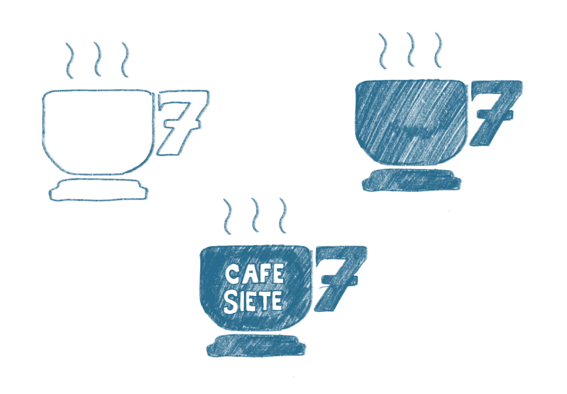
Concept 2: Workmark
Concept 3: Steamy 7
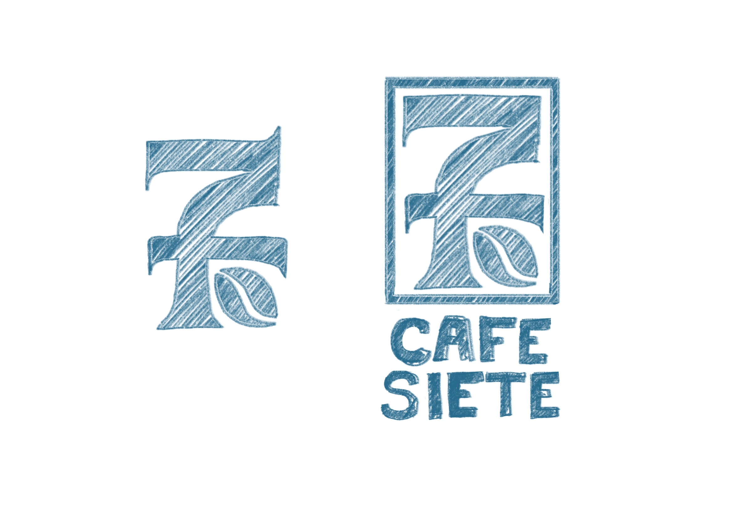
Concept 4: CrestConcept Selection
Jeb was most drawn the Concept 4: the Crest, as it incorporated a direct reference to the number 7, felt professional and stately, and included a fun coffee bean which could be used in other branded elements. I went ahead and created a refined version final version of the logo.
Step 3: FinaL Design
With the concept selected, I created a final version of the logo selected, I went ahead with designing a high-fidelity logo which included multiple variants.
Logo Breakdown

Variants
StandardFor all-purpose uses


HorizontalFor horizontal layouts

Logo MarkFor small size and text-free use
IconFor merch and branding uses

Brand Kit
The client selected Informa for the brant body font because of its clean lines & professional appearance. I presented this font as one of three options because of the similarites in letter form between Informa and Firelli (the logo font), especially the letters a, b, & t.
Step 4: Brand Design
Once the logo and brand font were finalized, I worked with Jeb to develop signage for the Café Siete storefront and business cards to represent the brand.
Store Signage
Signage MockupImplemented Vinyl Signage


